App Review: monday.com
App review from the perspective of a business analyst, an information technology specialist, and a pun aficionado. If you like this content, subscribe to my site and follow me on social media.

monday.com
Powerful Workplace environment
monday.com defines itself as a "work operating system" that enables organizations to build workflows and integrations to maximize productivity and collaboration. Large organizations, should I add.
You find Google Workspace limited. You dislike the clunkiness of SharePoint in your wall-to-wall Microsoft environment. You manage your work in e-mail threads and e-mail folders. Worse, you are still filling timesheets on paper sheets. monday.com might alleviate your pain.
Business Analyst Take
As a BA, I want to see how this application can enhance my team's productivity. If I am part of a large enterprise, or consulting small businesses, I need to justify the ROI for a high-priced product. Plus, everybody sort of hates Mondays.

Pictured: especially this cat.
Exploring the app
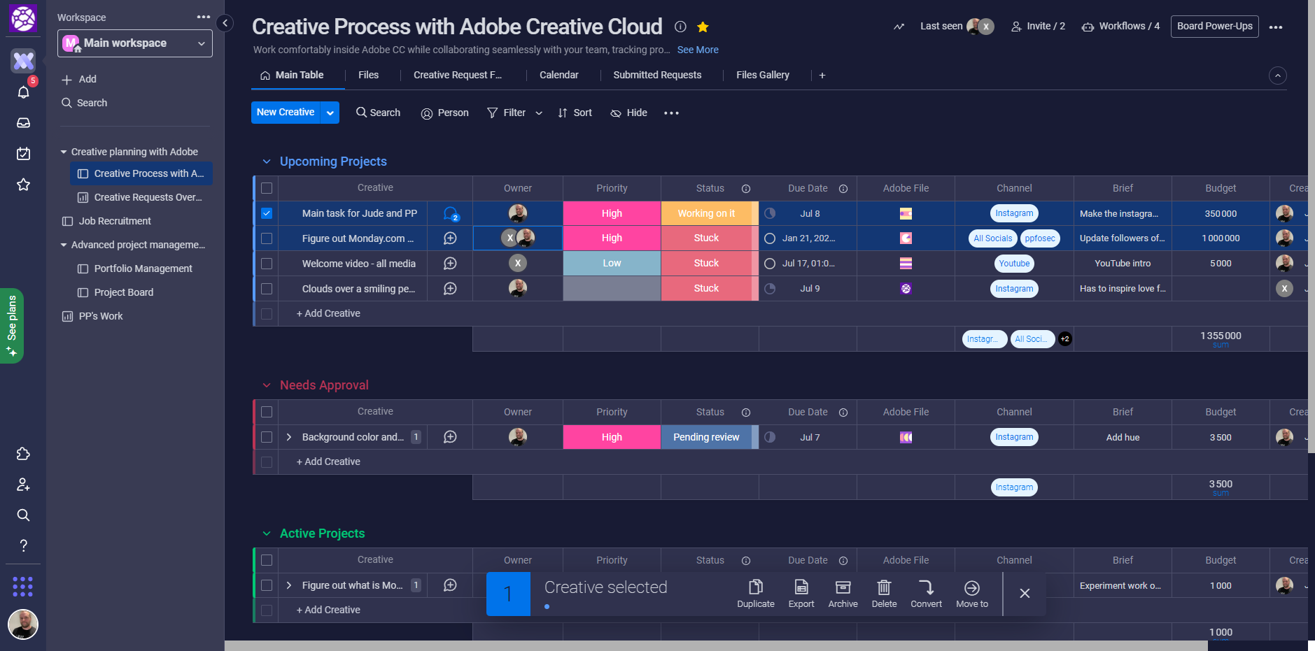
Below is what I was able to accomplish within an hour of using the app's free tier. I invited a randomly-generated "friend", Xinir, to view the app's aptitudes (heh - "app-app"!) in managing teamwork. I initially wanted to use monday.com to experiment with this website's graphic design workflows, so I picked the pre-populated "Creative Process with Adobe Creative Cloud" board. However, I was unable to make the integration between monday.com and Adobe work, probably due to not being on either app's high enough paid tier. I settled on the Job recruitment board because I know the business process well enough to imagine interesting workflows to build around it.
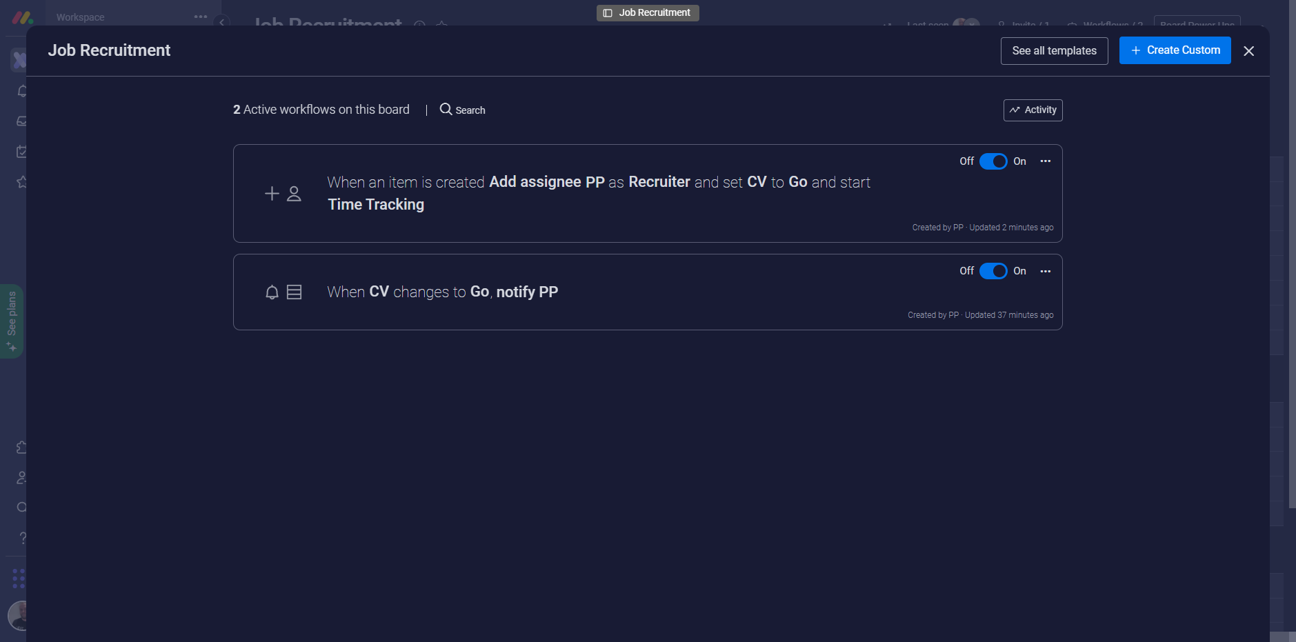
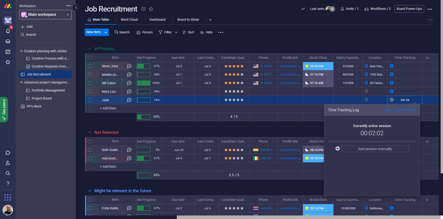
The second image shows two very simple workflows I have built: notify me when a CV gets approved and assign the ticket to me if it is a "Go" and start "time tracking". Mentions get sent both via email and mobile app push notifications, the latter of which to me is a must-have. I added the time tracking component because I hate filling time sheets and wanted to see if monday.com had a solution to relieve me. Do they? Nope. The time tracking is merely a timer that runs through your session, which probably gets forgotten so often that no useful metric can come out of it
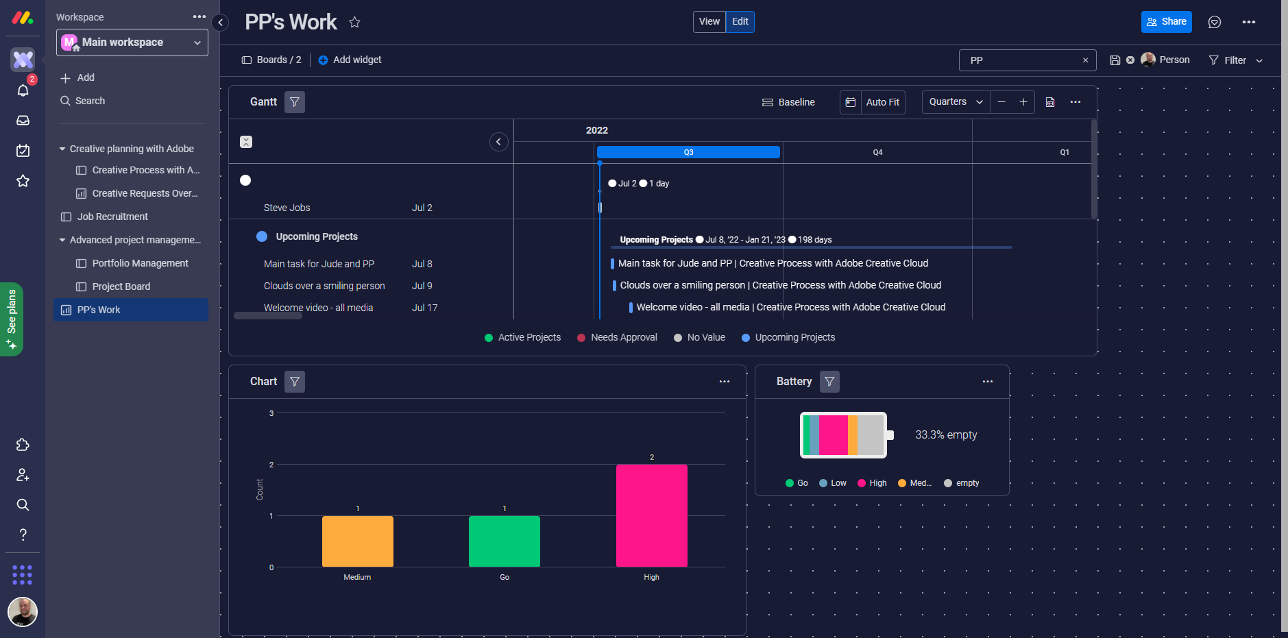
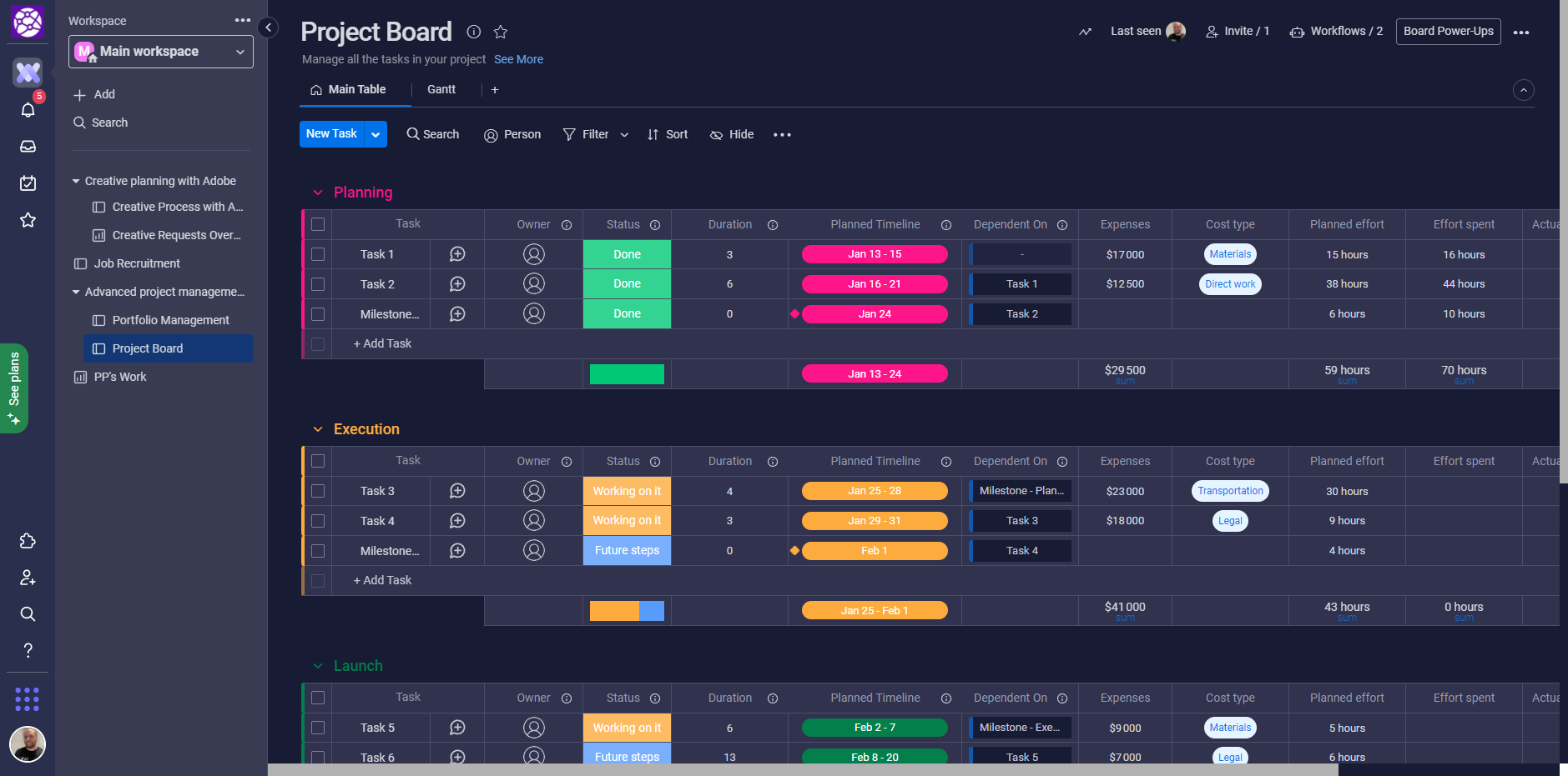
I built a custom dashboard to track my work across both boards with the free widgets and it looks like every project management tool you've ever seen. I finally browsed through the pre-populated "Project Management" board to see what the "core" business functionality of monday.com looked like. Let's face it: no matter how much monday.com insists it is a "work OS", at the end of the day this is a work management solution.
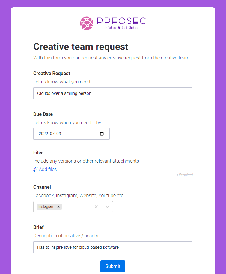
I did come across a cool beta feature, "Request forms", that automatically creates tickets based on a, well, form. I thought this is promising since I was overwhelmed by all the fields I had to create all. the. time. Unless you integrate with, for example, your job sourcing tool, prepare to input by hand a lot of info!
This might not seem like much, but I have to add that I began working on the mobile app version of the tool, which looks like this:
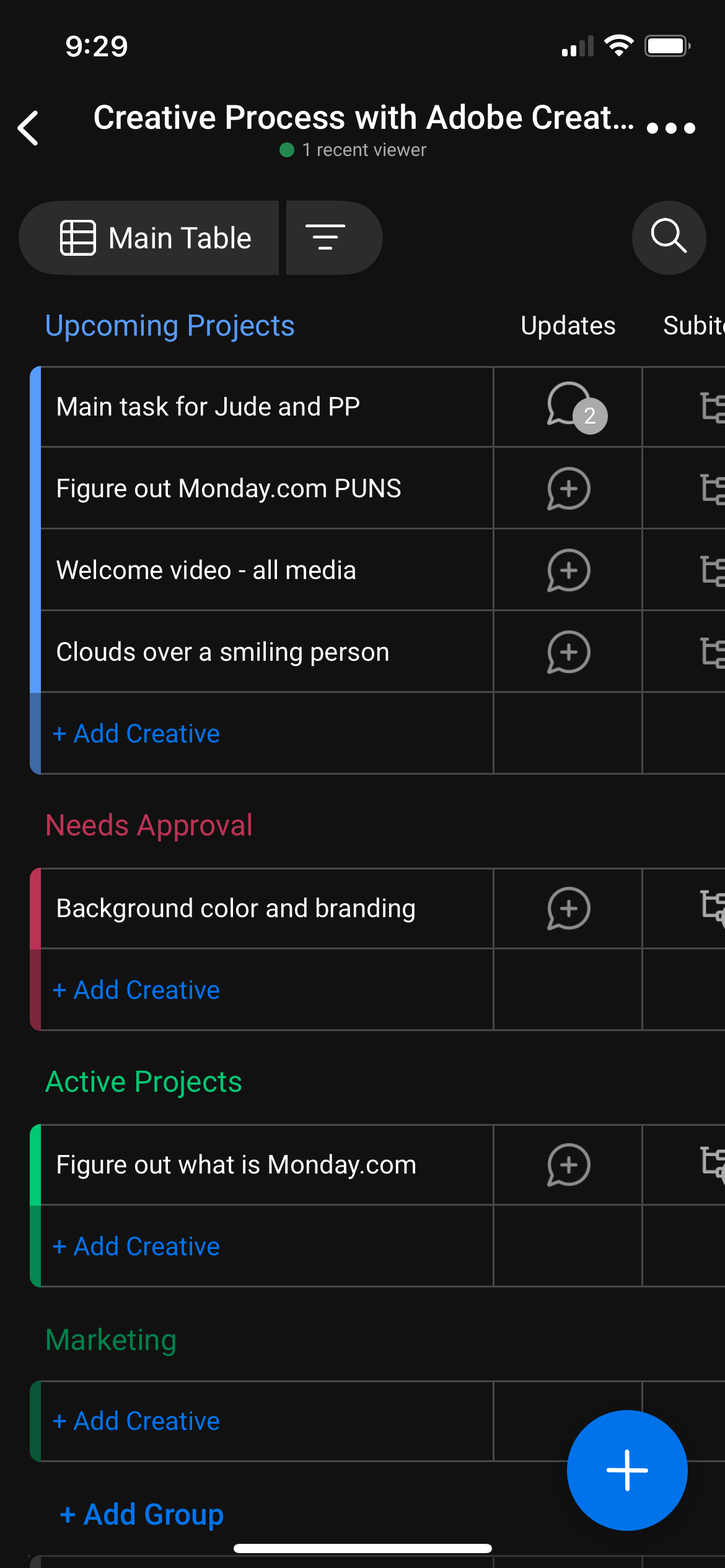
The side-scrolling is longer than the queue at the passport bureau.
The mobile version also does not have workflow-building capacity. I was so disappointed by the mobile experience that I was ready to ditch monday.com and write about something else. This app has been built for large enterprises and I figure mobile is not high on their priority list, even though it should be as I strongly believe in 2022 most work should be doable on my phone.
Frustration with the mobile experience is enhanced by frustration with filling items manually. Why am I inputting deadlines and budgets? Can't an AI estimate that for me or something?
Recommended Use Cases
monday.com feels powerful, scalable, and versatile. These capabilities seem especially useful for a large project management office (PMO). monday.com is excellent at letting your imagination run wild when you want to track and measure work.
Limitations
I believe monday.com suffers from an identity crisis. I did not research the history of the company, but I feel the product started out as a "project management spreadsheet on steroids" and the "work OS" components are being tacked on (successfully, might I add).

Pictured: a spreadsheet on Red Bull
For example, here is the functionality that allows me to set a status:
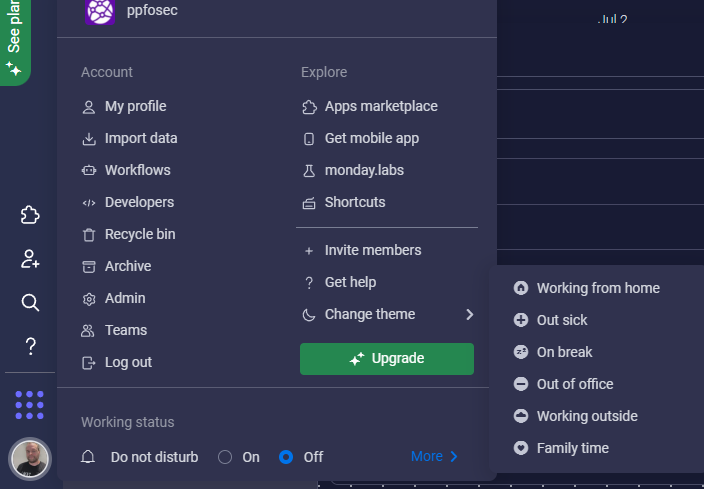
The working from home status, by the way, is used in coordination with advanced widgets that allow management to do a breakdown of workforce repartition. That feature to me defines the "identity" problem I'm highlighting. Work usually happens in video communications, specialized apps, spreadsheets, word processors (for masochists), emails, instant messages, and code repositories, all of which are outside monday.com. In my opinion, having individuals log their working status in a different tool than what they work in is not user-centric, it is management-centric, which is probably going to create resentment down the line. If I want to talk with Xinir, I want to see his/her (I haven't decided on gender yet) status in the app I will use, not go to the workplace app that management wants me to use to fill my timesheet and review my work tickets.

Trust me, I am a software enxinir
I see two ways out of this predicament. Either monday.com bolsters its capacity and tries to take on Microsoft to deliver the full suite of office applications, or monday.com becomes a "widget" inside those office applications that tracks (and one day hopefully learns and predicts) employee behaviours. That second option intrigues me: I do not see the big interest for me to go into this app to manually input the LinkedIn of Ada Lovelace ("Bio: I invented computers"). On the other hand, if, within my browser, monday.com can see my activity and ask me to send it to the app so it can be correlated to those boards, we might see the realization of "the future of work" that monday.com advertises.
Pricing
Pricing starts at $11/seat/month and the highest displayed tier is Pro at $22/user/month. For a large-ish enterprise of 500 individuals, even with a discount, this is a 6-digit investment. I see this platform as reaching its full potential when it needs to scale to thousands of employees. With the need for professional services, customer success, and even specialized external consulting, enterprises are looking at a million-dollar deal. As written above, monday.com to me is a strategic enterprise application for workplace experience, and I am reviewing it with this very high standard in mind.
I will discuss the enterprise plan in the technology section.
Technology Review
As an IT expert, I want to open the hood and see how this machine is built. I want to know everything about hosting, security, integrations, data processing standards, off-shore information transfers, privacy practices and what silly name the HR department came up with to name the employees. mondears? mondayans?
Hosting
monday.com is hosted in AWS (US) and recently added EU hosting. Engineering is located mainly in Israel, which benefits from adequacy decisions. Support location may be an issue for privacy assessments due to having affiliates in Singapore and Brasil; a support service provider is also located in Guatemala.
SLA by default is 99.9% which seems a bit low, although high availability for a workplace app may not be such an issue. I wonder if SLAs can be offered based on normal office hours.
I was a bit let down by the support and learning resources. Compared with some competitors, I felt the knowledge base was not comprehensive. The "bare bones" aspect was also present in the API documentation. I was excited by the GraphQL API but the user journey in the documentation felt a bit too "automatically generated" for my tastes. The good news is that UX design can address this minor gripe by creating "happy paths" for users.
Security
monday.com holds a full suite of ISO certifications as well as SOC 1, SOC 2 and HIPAA. Given how I interpreted the app as being government-friendly, I was very surprised by the absence of FedRAMP or AWS GovCloud offering. Security features are enterprise-grade with the availability of SSO, Auditing, Board sharing, and standard admin controls. I was perplexed by the Pro Plan offering Private Boards, which to me is quite a high tier for a feature I see as almost mandatory. I'm guessing this can be a way to push teams to a higher plan, but there are so many features that appeal to businesses to motivate a move to Pro that I was a tad disappointed.
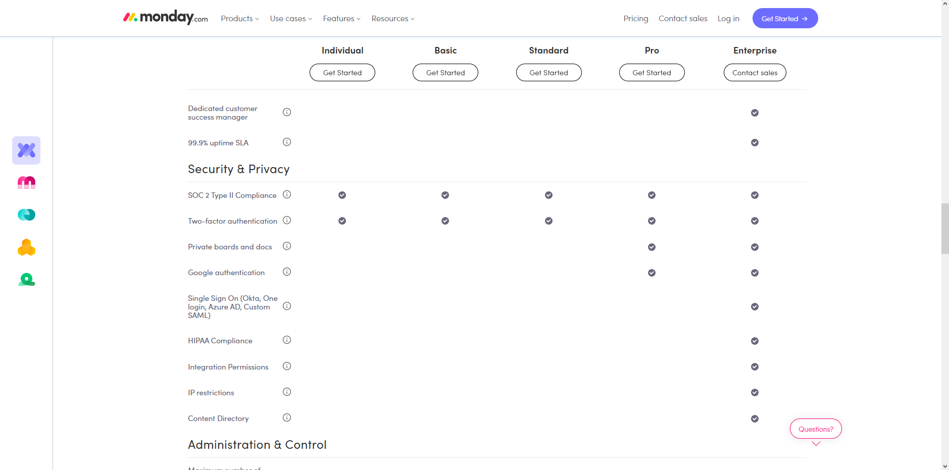
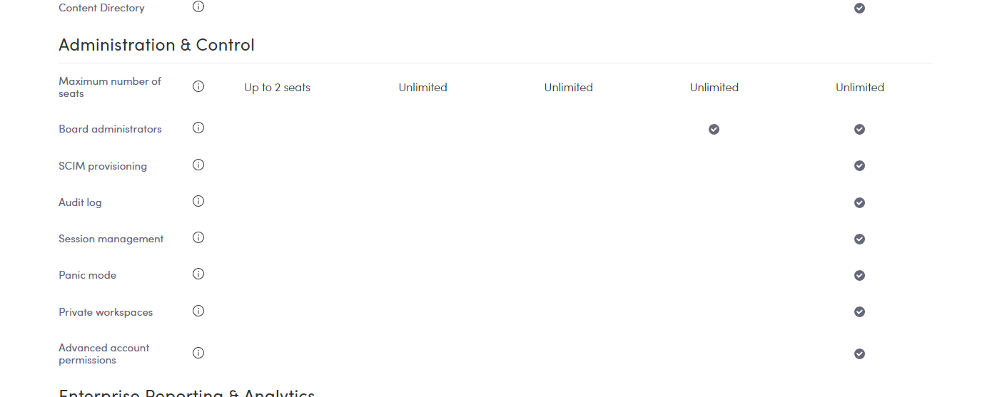
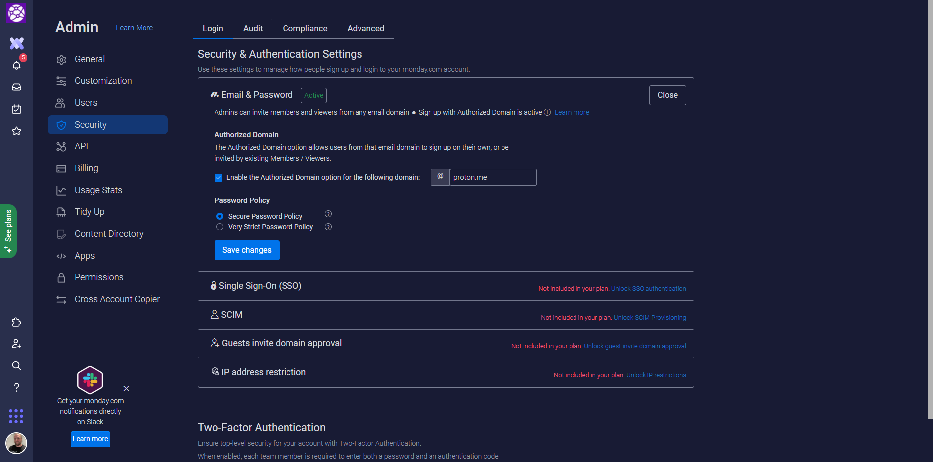
The legal documentation around privacy is top-notch and transparent. Being a workplace app, my guess is they do not feel the same pressure as consumer apps to monetize user content. The big question of course will be when data mining and AI come into play. If we go back to my job recruitment example above, I would expect my workplace app to recommend me candidates internally before I even post a job listing. But such recommendations are heavily regulated, by GDPR notably, due to the possibility of bias. If I was an enterprise customer, most of my discussions would revolve around AI capabilities and I would be very curious about monday.com's plans.
Conclusion
Pros
- Packs a punch and looks like it can scale to the largest enterprises
- Company growing rapidly with investments in AI (according to the careers page)
- Strong integration capabilities
- Near-infinite customization
- Templates marketplace
Cons
- Is a "work OS" but doesn't feel like where work actually happens
- The mobile experience is not optimal
- Gave me a feeling that I needed to manually input fields so management could review my work instead of me using the app to be more productive.
Verdict
- monday.com would be my #1 choice if I ever advised a large bureaucratic organization on how to get out of fax and papers to a modern application. If an organization commits millions, monday.com can change your workplace. Just don't expect the "future of work". It's more like the present of work.

Pictured: not a customer of monday.com
