App Review: Quire
Quire's got all the basics of a project management app: Kanban, lists, Gantt, calendar. But no "I didn't know I wanted that!" feature.


Good looking basic collaboration tool
I got a big part of how I view business and technology leadership from watching Simon Sinek TED talks. I know how corny that sounds! Still, I always "start with why" for everything I write and every presentation I build. This "WHY" drives my app reviews as well.
Everybody can build a project management app. Tasks, calendars, assignees, charts... We have figured out the database models to represent work! You have hundreds of open source projects to build Gantt Charts for every framework imaginable! What those collaboration and work apps need is an inspiration. An app must by itself drive engagement.
You can imagine my reaction when I landed on Quire's homepage:

Sign me up! The marketing team sure did its job! Can the app back it up? Let's find out.
Exploring the app
Landing in the app, I was invited to create the usual tasks. The tasks convert nicely into a Kanban board. And that's pretty much it. The Gantt Chart view and Calendar Views are paywalled. I settled on the 30-day free professional-tier trial to give the app a fair review.
I created tasks around my website redesign and a new value proposition I want to bring my readers. I invited Jose, my new bot consultant, to test collaboration features. After less than 30 minutes of work, I had a prototype ready that I could use everyday (see images).
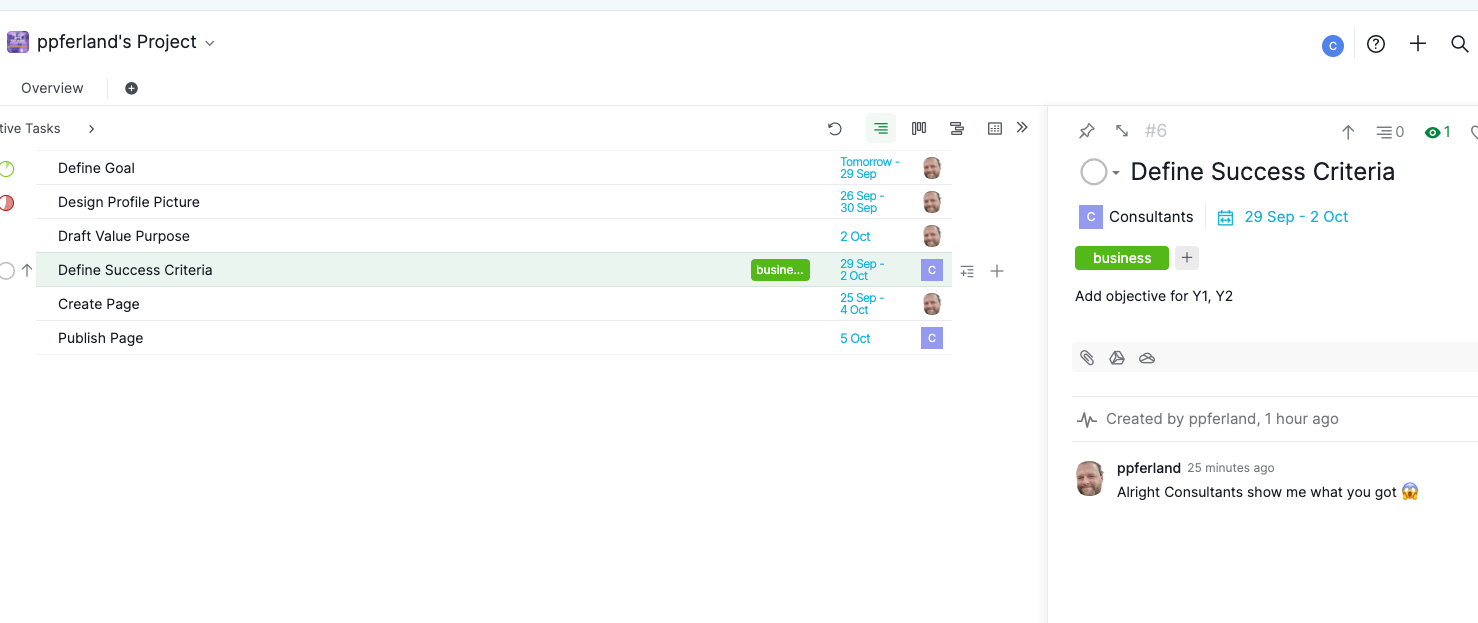
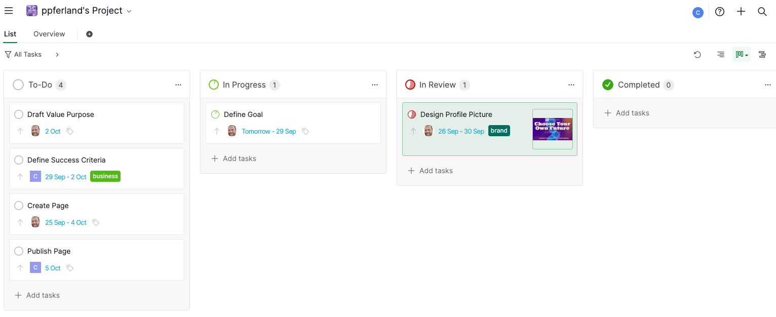
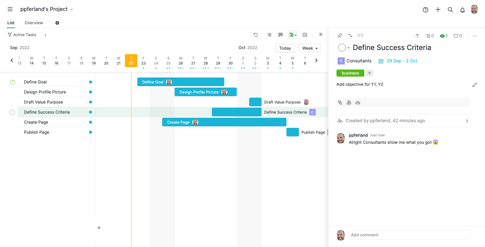
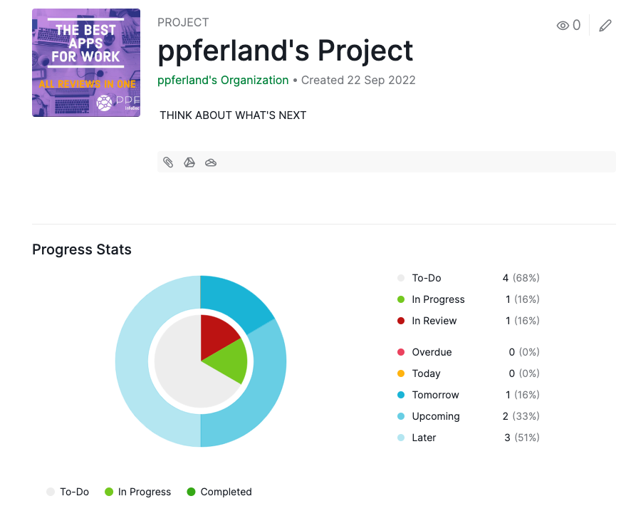
That's it. Quire offers a "Smart Folder" feature, but it's pretty much only a way to put tasks in a different point of view. I tried the iOS App, and it was uneventful. Gantt and Kanban have an infinite left-swiping problem.
We should not judge an app on its number of features. What matters is how the design responds to business needs and how the functionalities integrate into our day to day. Quire just... doesn't have anything that pops up. There is no "I didn't know I wanted that!" feature.
It's got all the basics of what we expect from a project management app. Quire delivers them with a well-rounded colour palette and good performance. I just couldn't find the inspirational idea.
Recommended Use Cases
Quire's rather basic feature set allows teams to hit the ground running. No learning curve, no setups, no constellation of buttons. Imagine being hired as a manager in a chaotic business. You have 90 days to make an impact on the team. Pop up Quire, set up a list, assign tasks, and you're off to the races.
Limitations
I hate to admit it, but the marketing set my expectations too high. I can't inspire my team with only 20 emojis built-in!
In the end, Quire's a good-looking app that cannot differentiate. The company operates in an extremely crowded market. What's the hook?
Pricing
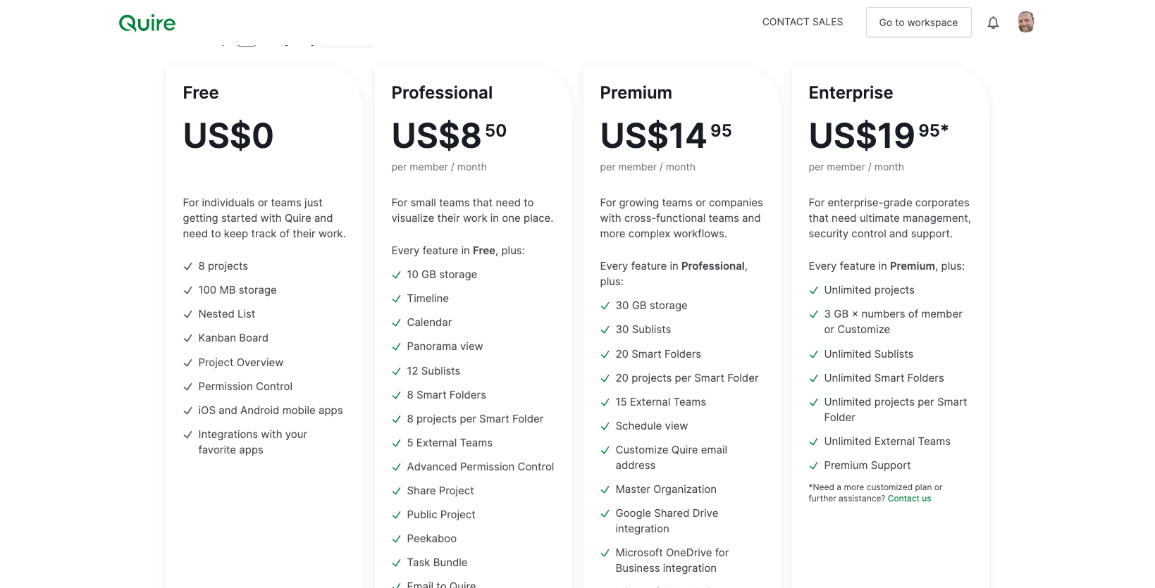
Quire offers a very limited free tier. The Calendar and Gantt are only available on the professional plan (USD$8.50/user/month). The pricing tiering follows engineering-driven requirements such as storage and sublists limits. If Quire went all in and charged dynamically on the number of sublists active in any given month, selling "bundles" of tasks, that might have been interesting. Nobody goes to their CIO excited by "30 GB storage". In fact, most small business buyers don't know and don't care what a gigabit is!
Verdict
Quire is a pleasant and easy project management app that does the basics very well. Its lack of differentiative features lets down potential customers who were excited by the marketing's rhetoric. To quote Simon Sinek: great organizations "are good at giving us things we would never think of asking for." Quire has yet to achieve this level.
